

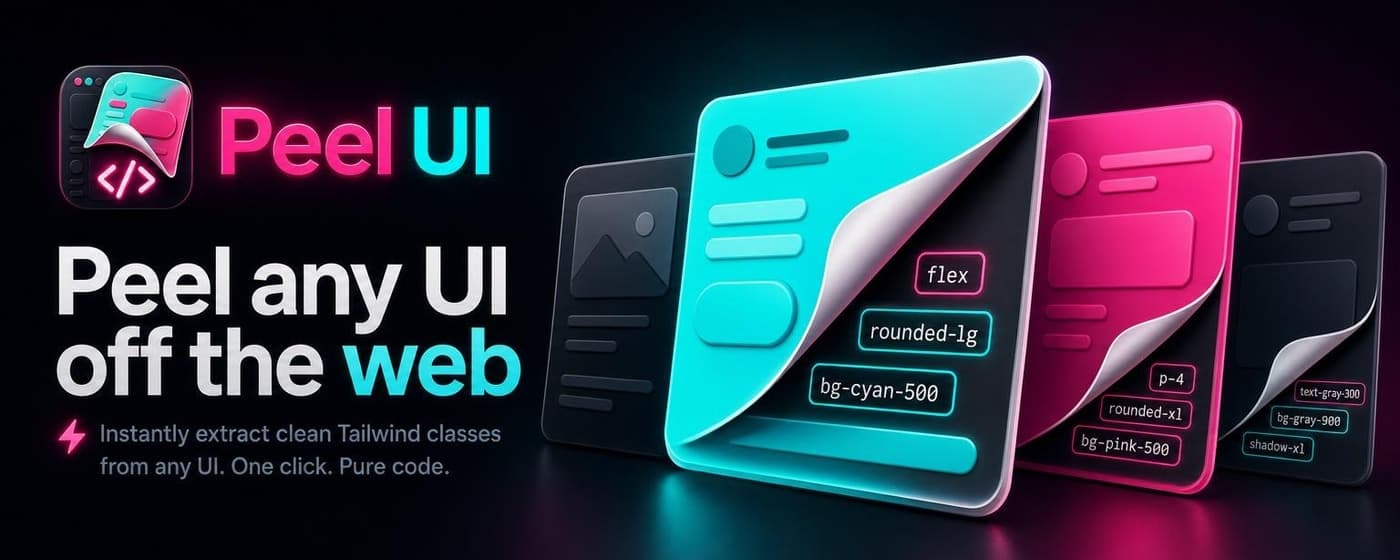
A Chrome extension listing needs an icon, promo tiles, five screenshots, and copy that tells someone what the thing does in one read.
I turned the workflow I used for Peel UI into an open-source skill:
- Phase 1: 4–6 unrelated icon concepts, pick one
- Phase 2: Brand guide from the winning icon
- Phase 3: Promo tiles, benefit slides, and
product-details.md - Install:
npx skills add Illyism/dev-skills --skill extension-store-assets
You can ship clean code and still lose the click if the store listing looks like an uncropped Figma export. Chrome wants a 128×128 toolbar icon, a 440×280 small promo, a 1400×560 marquee, up to five 1280×800 screenshots, and a short description capped at 132 characters.
I built Peel UI (copy any UI element as Tailwind or CSS) and needed the full store asset set: icon, brand guide, promo tiles, five benefit slides, listing copy. I wrote a three-phase workflow, packaged it as a Cursor skill, and stopped opening Figma for every extension.
What Chrome wants
| Asset | Size |
|---|---|
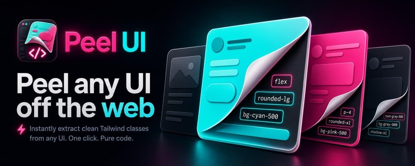
| Small promo tile | 440×280 |
| Marquee promo tile | 1400×560 |
| Screenshots | 1280×800 (up to 5) |
| Extension icon | 128×128 source |
Three common mistakes: popup screenshots (valid upload, weak listing), hiring a designer per extension (fine if you have budget), generic purple clipboard icons (same as the other forty dev tools in the aisle).
Google's guidance favors promotional slides that explain the job. Show what the extension does, not what the popup looks like zoomed to 90%.
Three phases: concepts → brand → store
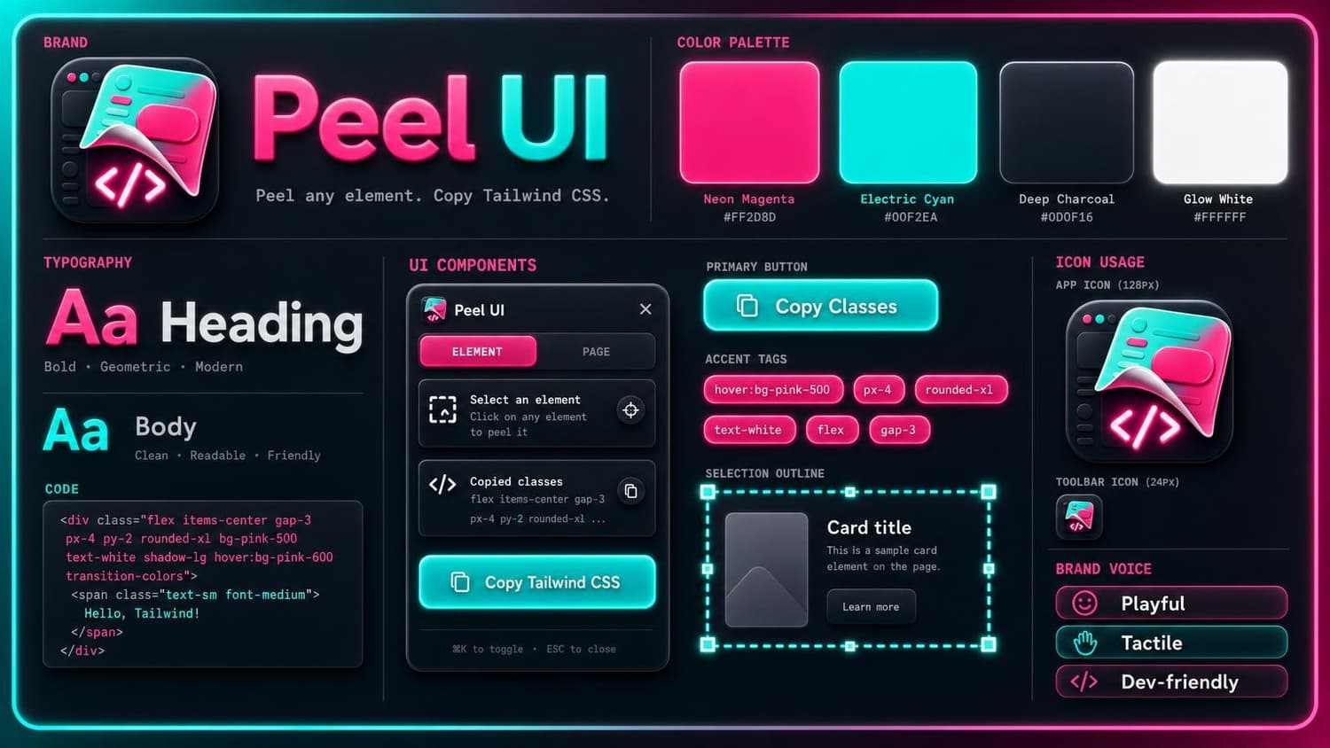
Phase 1: Icon directions
Generate 4–6 unrelated visual worlds before you commit. Peel UI got a sticker peel, a UI magnet, and a wand inspector.
Each concept lands as a 1:1 JPG. A preview.html grid lets you compare them. Pick one, set iconFile in brand.config.json, delete the rest.
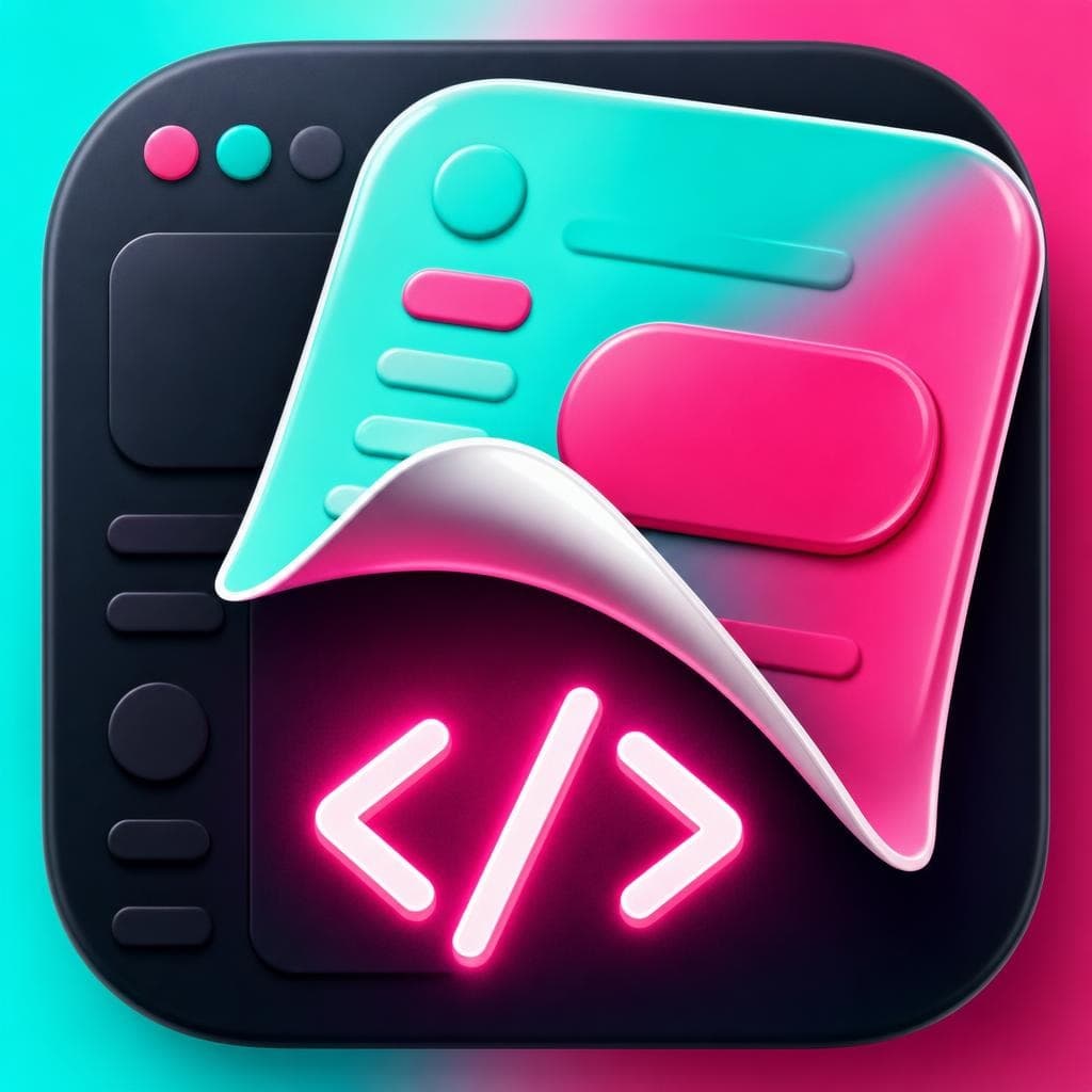
Phase 2: Brand guide
After you pick an icon, generate a 16:9 brand guide: hex palette, typography direction, button mocks, 24px toolbar glyph, voice tags. Every store slide references this file.
The generator sends your picked icon as input_reference so phase 3 stays on palette.
Phase 3: Store assets and listing copy
The store phase outputs:
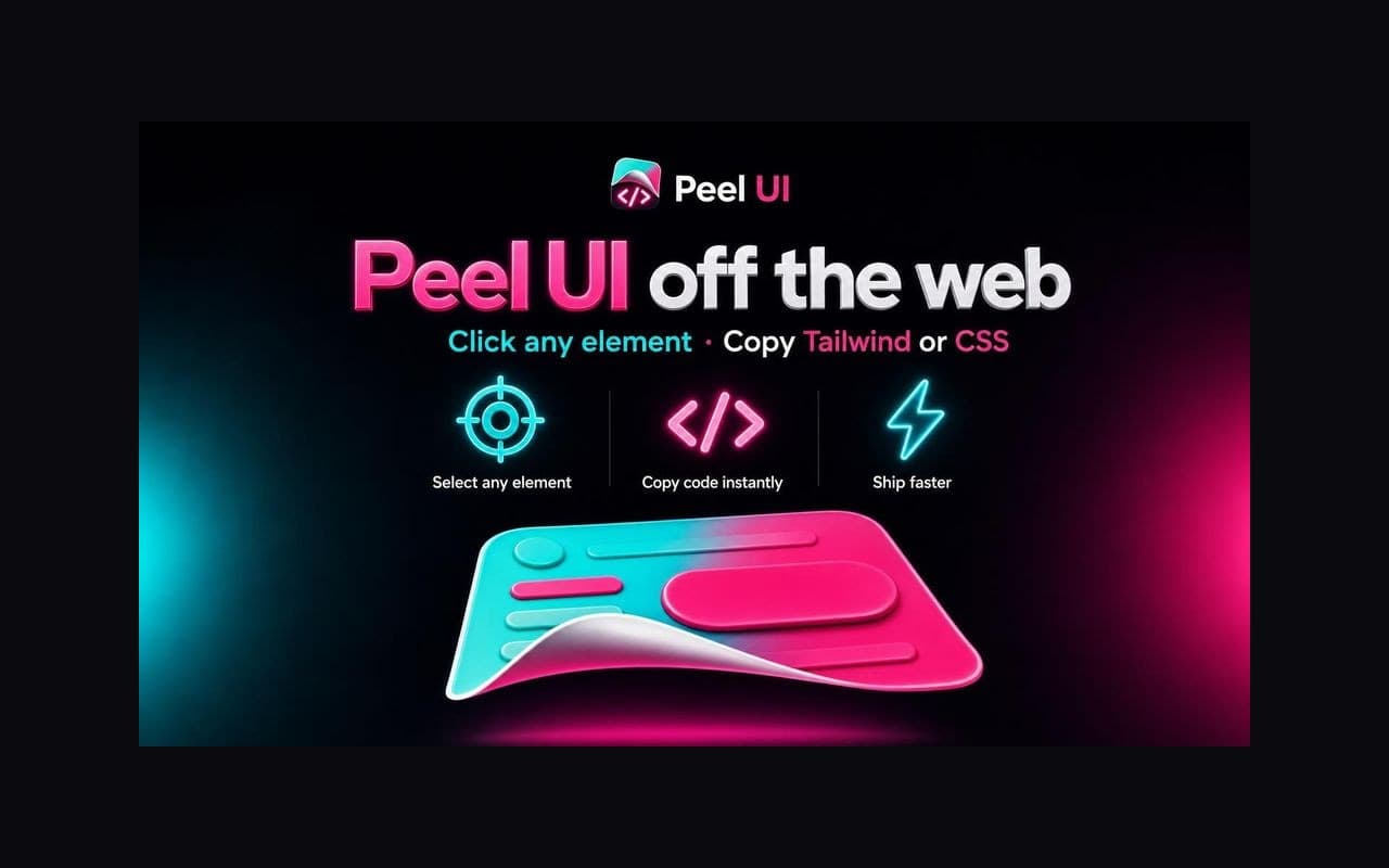
- Promo small (440×280) and marquee (1400×560)
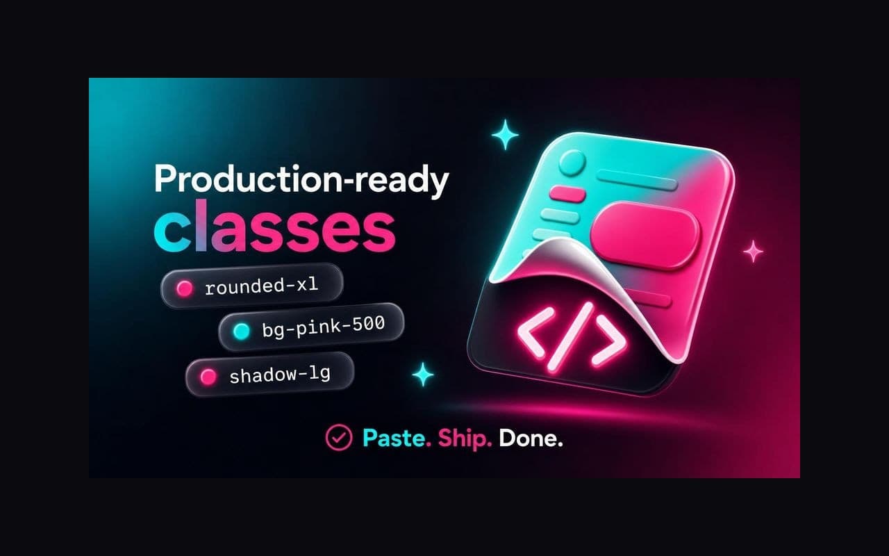
- Five benefit slides at 1280×800
product-details.mdwith a ≤132-char short description plus the long listing
Slides should fill the 16:9 frame: multi-column layout, concrete sample data, no letterboxed icon floating on empty background.
| Slide | Peel UI focus |
|---|---|
| 1 | Hero value prop |
| 2 | How it works (3 steps) |
| 3 | Before/after (screenshot vs code) |
| 4 | Export formats (Tailwind vs CSS) |
| 5 | Production-ready classes |
The generator
One brand.config.json per extension:
{
  "productName": "Peel UI",
  "outputDir": "public/_static/peel-ui",
  "iconFile": "concept-peel-sticker.jpg",
  "brand": {
    "promptPrefix": "Peel UI brand: neon magenta #FF2D8A, electric cyan #00E5FF...",
    "paddingColor": [10, 10, 15],
    "paddingPercent": 0
  },
  "concepts": [ "..." ],
  "brandGuide": { "file": "peel-brand-guide.jpg", "prompt": "..." },
  "store": {
    "promo": [ "..." ],
    "screenshots": [ "..." ]
  }
}
skills/product/extension-store-assets/scripts/generate.ts calls OpenRouter gpt-image-2 and resizes with sharp. Screenshots default to full bleed (fit: cover, paddingPercent: 0). Background color runs edge to edge. Bump paddingPercent above zero only if you want letterboxing.
Store-ready slides share these traits:
- Background hits all four edges
- Multi-column layout with UI widgets and sample data
- Contrasting card pairs with clear before/after or format comparison
- Decorative elements bleeding off the canvas
Regenerate slides only:
set -a && source .env && set +a
bun .cursor/skills/extension-store-assets/scripts/generate.ts \
  --config=public/_static/peel-ui/brand.config.json \
  --phase=store --screenshots-only
Peel UI has a wrapper at public/_static/peel-ui/store/generate-store-assets.ts if you want a project-local entry point.
Peel UI listing copy
The skill writes store/product-details.md from a template. Peel UI short description:
Peel any UI element off the web. Click to copy clean Tailwind v4 classes or plain CSS, no DevTools digging.
108 characters. Chrome caps the short description at 132.
Full example: public/_static/peel-ui/store/product-details.md.
Install the skill
Generates browser extension brand icons, Chrome Web Store promo tiles, promotional screenshots, brand guides, and listing copy. Uses OpenRouter gpt-image-2 via lib/blog-image-generator. Use when creating extension branding, Chrome Web Store assets, app icon concepts, store descriptions, or /extension-store-assets workflows.
# Extension store assets

Three-phase workflow for extension branding + Chrome Web Store listing. Self-contained script uses OpenRouter `gpt-image-2` directly (no blog-image-generator dependency).

## Phases

| Phase | Goal | Output |
|-------|------|--------|
| **1. Concepts** | Explore 4–6 unrelated brand directions | `concept-*.jpg` (1:1) + `preview.html` |
| **2. Pick + refine** | User picks one; delete losers; optional brand guide | `app-icon.jpg`, `brand-guide.jpg` |
| **3. Store** | Promo tiles, promo slides, listing copy | `store/*` |

Do **not** skip phase 1. Do **not** generate literal UI screenshots for store slides — use **promotional concept slides** that explain benefits.

## Setup

1. Copy [brand.config.example.json](brand.config.example.json) → `{outputDir}/brand.config.json`
2. Fill in product name, brand prompt prefix, colors, concept prompts, store slide prompts
3. Run from repo root with env loaded

## Commands

```bash
set -a && source .env && set +a && bun .cursor/skills/extension-store-assets/scripts/generate.ts --config=public/_static/peel-ui/brand.config.json --phase=concepts

set -a && source .env && set +a && bun .cursor/skills/extension-store-assets/scripts/generate.ts --config=public/_static/peel-ui/brand.config.json --phase=brand-guide

set -a && source .env && set +a && bun .cursor/skills/extension-store-assets/scripts/generate.ts --config=public/_static/peel-ui/brand.config.json --phase=store

set -a && source .env && set +a && bun .cursor/skills/extension-store-assets/scripts/generate.ts --config=public/_static/peel-ui/brand.config.json --phase=store --screenshots-only
```

After phase 1, user picks a concept → set `iconFile` in config to that filename → delete other concepts → run phase 2 and 3.

## Store asset rules

See [sizes.md](sizes.md) for exact dimensions.

**Promo tiles** — generate at closest aspect ratio, `fit: cover` to exact size.

**Store screenshots (1280×800)** — promotional benefit slides, NOT fake browser/extension UI mocks. Generate at 16:9, scale with `fit: cover` to exact size (full bleed). Set `paddingPercent: 0` in config (default).

**What makes slides look store-ready** (see `public/_static/peel-ui/store/`):

- Background color/texture fills all four edges — no letterbox margin
- Decorative elements (glows, class pills, footer bars) bleed off canvas edges
- Content uses **multi-column editorial layout** that fills the frame — not a small centered island
- **Concrete UI widgets with sample data** (class names, code snippets, button states) — not abstract icon rows alone
- Contrasting card pairs (before vs after, format A vs format B)
- Bottom footer bar or three-icon feature row anchors the composition

See [prompts.md](prompts.md) for per-slide composition templates.

**Listing copy** — write `store/product-details.md` using [product-details-template.md](product-details-template.md). Short description ≤132 chars.

## Prompt patterns

See [prompts.md](prompts.md).

**Concept icons:** distinct visual worlds — not literal clipboard/marquee dev-tool clichés unless requested. Fun, beautiful, readable at 16px.

**Brand guide:** 16:9 cheat sheet — palette, typography, UI components, icon usage. Use picked icon as `input_reference`.

**Store slides (5 max):** hero value prop → how it works → key benefit → feature depth → format/compare. Concept illustration only.

## Do not

- Edit `lib/blog-image-generator/generate.ts`
- Use blog `_references/` style refs (raw prompts only)
- Generate literal screenshots for Chrome store slides
- Letterbox 1280×800 slides unless `paddingPercent > 0` is explicitly set
- Center small content on a large empty background — use multi-column layouts that fill the frame
- Abstract icon-only slides with no sample data or UI widgets
- Skip visual review before shipping

## Paths

| Item | Path |
|------|------|
| Generator script | `.cursor/skills/extension-store-assets/scripts/generate.ts` |
| Example config | `.cursor/skills/extension-store-assets/brand.config.example.json` |
| Size reference | `.cursor/skills/extension-store-assets/sizes.md` |
| Copy template | `.cursor/skills/extension-store-assets/product-details-template.md` |
| Prompt patterns | `.cursor/skills/extension-store-assets/prompts.md` |
| Peel UI example | `public/_static/peel-ui/brand.config.json` |

## Peel UI reference

Worked example in `public/_static/peel-ui/` — neon magenta + cyan, sticker-peel metaphor. Store slides: `store/screenshot-01-hero` through `screenshot-05-formats`.npx skills add Illyism/dev-skills --skill extension-store-assetsPrompt Cursor:
"Run extension-store-assets phase 1 for my new extension. Output to public/_static/my-extension/"
Worked example config: public/_static/peel-ui/brand.config.json
All skills: il.ly/skills.
Notes from the Peel UI run
- Run phase 1. "Just make the icon" locks you into the first mediocre direction.
- Ban browser frames in prompts. Models default to fake Chrome windows.
- Fill the frame. Multi-column layouts with sample data beat centered icon rows on empty background.
- One slide, one idea. Hero + picker + export in one 1280×800 image reads cramped.
- Check the 440×280 promo at thumbnail size. If the wordmark disappears, rewrite the prompt.
Related: 17 Chrome extension ideas worth building · How I run minimal AI evals · Outputmaxxing philosophy